Nested Flex Containers with Flexbox
You can create two dimensional layouts by nesting a flex container inside another one.
Flexbox is inherently a one dimensional layout model. Flex items within a flex container can be laid out either horizontally or vertically, but not both. If you want to lay out items in both dimensions, you'll need to nest a flex container inside another one.
Like this:
In this example we apply display: flex to both the outer container and to the red flex item. But with the red flex item, we use flex-direction: column, which causes its flex items to stack up vertically on top of each other. The default value for flex-direction is row, so that's why we didn't bother using this property for the outer container — the flex items are laid out in a row by default.
Two Dimensional Website Layouts
When we built our holy grail layout example previously, we only used flexbox for the middle section. The header and footer remained as block elements. We used flexbox to lay out three flex items horizontally (in a row). We didn't specify any flexbox items to go vertically (in a column). In other words, our flexbox was a one dimensional layout. Even though the page as a whole was actually a two dimensional layout, the flexbox portion only provided the layout in one of those dimensions.
We could modify that example so that we use flexbox across both dimensions — the row and the column. We can do this using the same concept as above. That is, we can use one flex container for the vertical layout, and another for the horizontal layout.
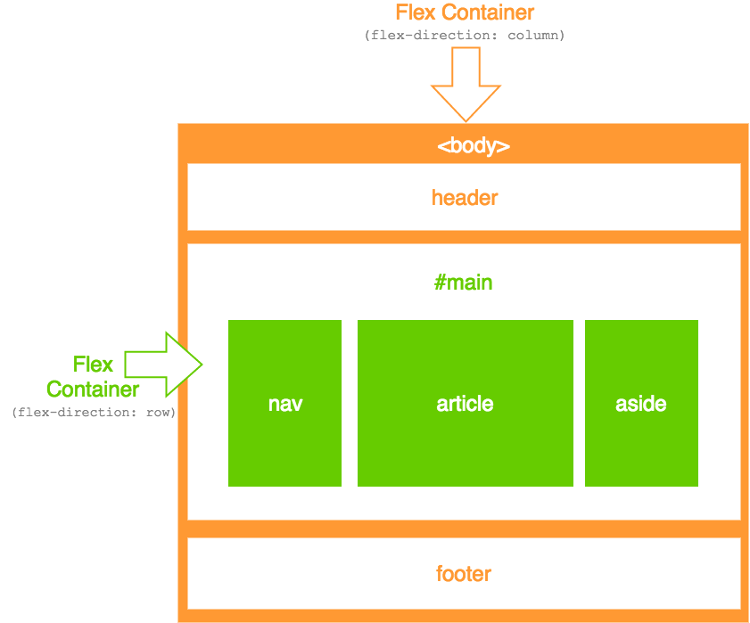
In this case, the vertical layout consists of the header, main, and footer areas. You can think of the whole page as one big column. And that column contains three rows — one for the header, one for the main content area, and one for the footer.
The horizontal layout consists of the nav, article, and aside areas. These are all contained within the second row, but they need to be laid out horizontally. Therefore, we can make the second row a flex container and have its contents flow across the row.
So here's a working example:
In this case, we used the following code for the body element:
The display: flex makes it a flex container and the flex-direction: column makes its flex items display in a column.
We also apply a minimum height to the outer flex container so that the layout takes up the full height of the screen.
And now for the nested flex container:
Adding display: flex makes it a flex container just like the other one. Now its in-flow children become flex items. The flex: 1 ensures that it grows so that it occupies the maximum amount of space available.
We could've used flex-direction: row to explicitly specify its direction, but row is the default value anyway.
And then the rest is just styling and ordering the flex items within the nested flex container:
You may be wondering why you'd bother using nested flex containers when you could've just done a one dimensional flex layout like our previous example.
In many cases, you probably won't need to nest flex containers like this. However, this technique could come in handy when using responsive web design. Having the whole layout in flexbox will provide you with more options when using media queries to display different layouts to different devices, etc. Without doing this, you can only harness the power of flexbox on the flexbox part of the website.
Also, I'm sure you could think of many other uses for nested flex containers than for website layouts.